Dashboards
TCAP envisions equitable net-zero carbon in the Teton Region by 2030. Below are three dashboards to track progress toward that vision. The Community Connectedness Dashboard tracks the community’s sense of belonging, engagement, and connectedness. The Emissions Dashboard tracks the greenhouse gas emissions from human action that cause climate change. The Climate Dashboard tracks how the climate has and is expected to change.
To best view the dashboards, select the full-screen button on the bottom right-hand corner of the charts. If you have suggestions on how to improve the dashboards, please share them with us at feedback@tetonclimateaction.org. The dashboards were created thanks to the support of the Community Foundation of Jackson Hole.
The below charts illustrate emission trends by sector. Use the toggle functions to explore how climate action might impact emissions in a particular and overall. The baseline for this model is the Jackson/Teton County Comprehensive Plan Indicator Report.
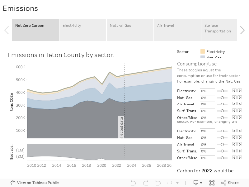
Emissions Dashboard
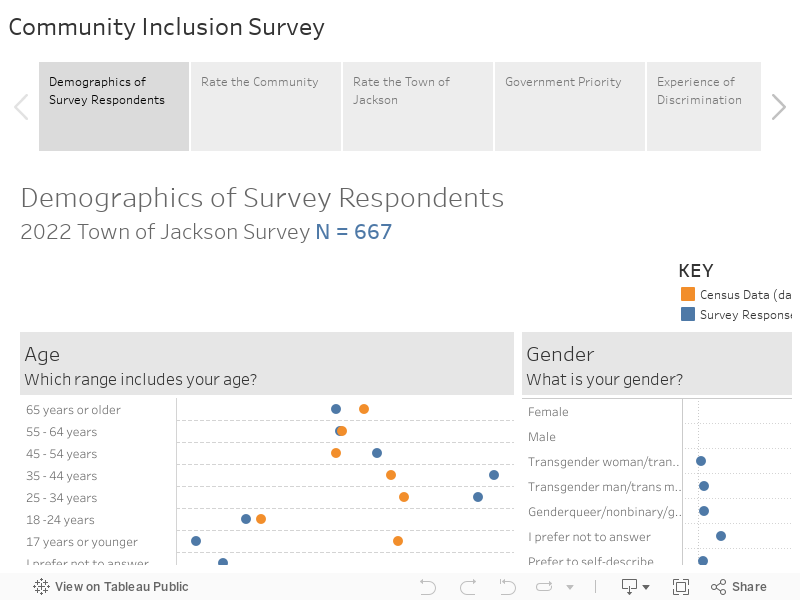
TCAP is committed to creating an inclusive environment where everyone feels welcome and empowered. The below charts show the community’s sense of belonging, engagement, and community connectedness. Use the toggle functions to explore how different members of the community experience the community. The data is from a survey conducted by the Town of Jackson. As the survey is repeated in future years, this dashboard will reflect changes in community members’ experiences.
Community Connectedness Dashboard
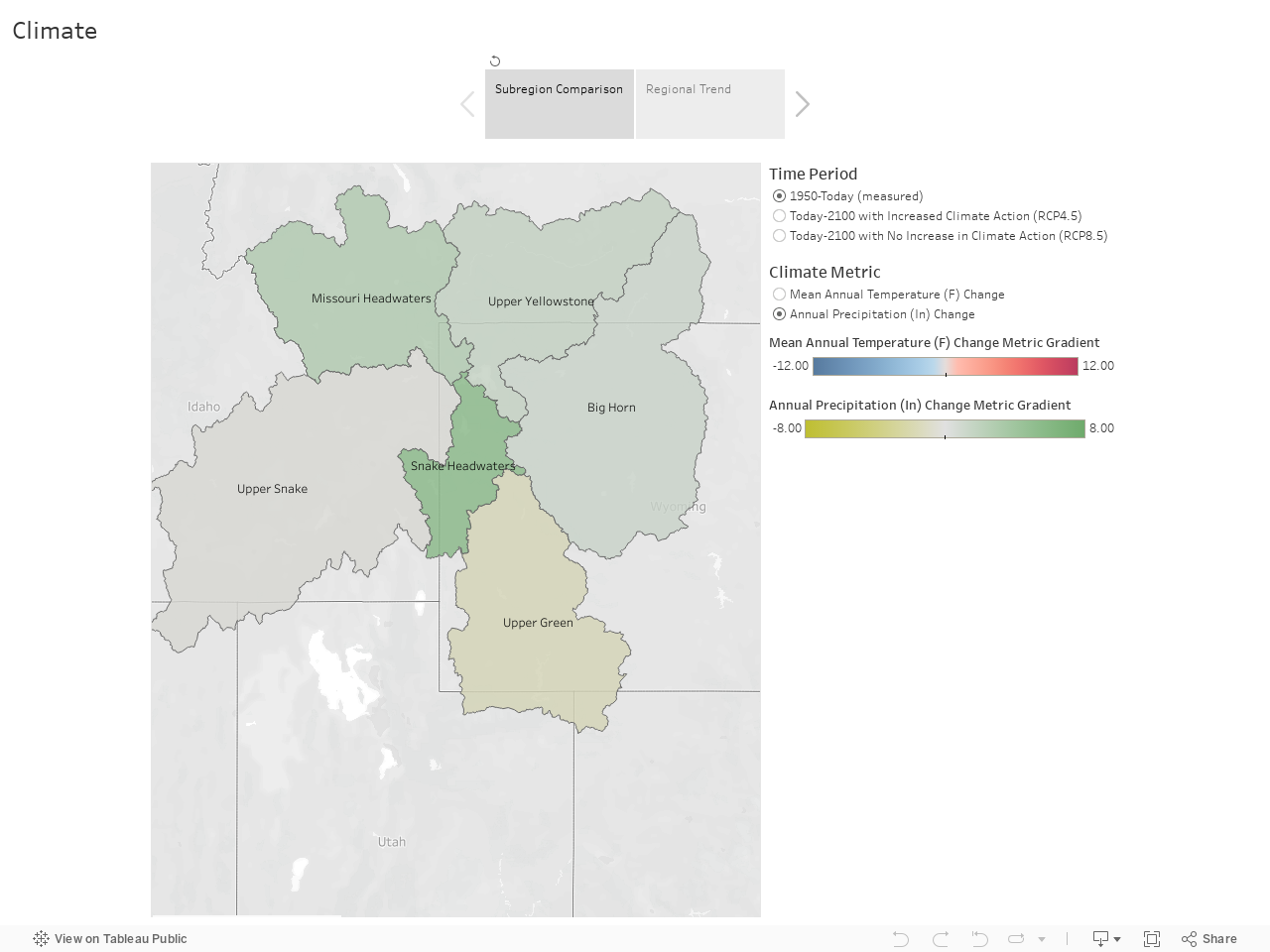
The below charts illustrate how the climate has changed since 1950 and is projected to change by 2100. Use the toggles to look at the past or projected climate change under different climate action scenarios throughout the region. The data is from the Greater Yellowstone Climate Assessment.
Climate Dashboard